Introduction
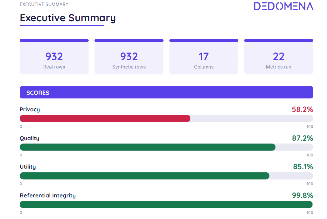
When one of Dedomena's synthesis algorithms finishes training, Nucleus can evaluate the result and produce two documents at once:
-
report.pdf— the report a person reads. -
evaluation.json— the same content as data, to be consumed with code.
Both come out of the same evaluation object, so they cannot say different things. The JSON also carries every figure that the PDF only shows in part: a screen can scroll, a PDF cannot.
What the JSON is for
It is the evaluation in data form, and that makes possible things a PDF does not:
-
Compare synthesizers against each other, metric by metric, instead of eyeballing two documents.
-
Decide on training with code. If utility comes out below a threshold, retrain with more epochs; if privacy comes out low, retrain or switch algorithms. The decision stops being manual.
-
Schedule retraining and track how the same table evolves over time.
-
Integrate the result into a dashboard, a report of your own, or a quality gate inside a data pipeline.
The JSON declares its version in meta.schema_version, today 1.4. It is worth pinning: a field that moves is a version you can reject, rather than a chart that silently comes up empty or a comparison between two runs that no longer compares the same thing.
To compute the metrics, a sample of real and synthetic data is taken so that the calculation does not become a bottleneck.
Scores
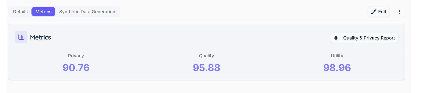
Dedomena gives three scores, and a fourth one when the dataset is relational:
| Score | What it answers |
|---|---|
| Privacy | Whether an individual from the real data can be found in the synthetic data, or inferred from it. |
| Quality | Whether the synthetic data reproduces the distributions of the real data and the relationships between its columns. |
| Utility | Whether the synthetic data is good enough to train models that work on real data. |
| Referential Integrity | (multi-table only) Whether the tables still hold together as a schema. |
All four run from 0 to 100 and share the same cut-offs:
| Band | Range | Color in the report |
|---|---|---|
excellent | > 80 | green |
fair | 60 – 80 | amber |
poor | 40 – 60 | red |
critical | ≤ 40 | red |
An unmeasured metric is not a bad metric
When something cannot be computed on a particular dataset —Cramér's V needs two categorical columns, the date metrics need a date column— the metric is marked not applicable and its weight is redistributed among those that were computed. It is not filled in with a zero or a default value: in the JSON it travels as applicable: false with the reason, and in the PDF it comes out blank.
That is the difference between "we measured it and it came out badly" and "it could not be measured", and a number on its own never tells you which.
Privacy
| Metric | What it measures | Optimum | Bands |
|---|---|---|---|
| Relative DCR | Distance from each real record to its nearest synthetic neighbor, divided by what separates the real records from each other at the same percentile. | high | excellent > 0.95 · fair ≤ 0.95 · poor ≤ 0.8 · critical ≤ 0.5 |
| Exact Match Score (EMS) | Share of synthetic rows that reproduce a real one exactly. | 0 | excellent = 0 · good ≤ 0.1 · poor ≤ 0.5 · critical > 0.5 |
| Nearest Neighbour Distance Ratio (NNDR) | Ratio between the distance to the nearest neighbor and the distance to the second nearest. | high | excellent > 0.7 · fair ≤ 0.7 · critical ≤ 0.1 |
| Authenticity (relative) | Share of synthetic records that are not near-copies of a specific real record, divided by that same share measured among the real records themselves. | high | excellent > 0.9 · fair ≤ 0.9 · poor ≤ 0.7 · critical ≤ 0.3 |
| Attribute Inference Attack (AIA) | Whether a real attribute can be inferred from the synthetic data. | high | excellent > 0.8 · poor ≤ 0.8 |
| Singling Out Risk (with control set) | Risk of isolating an individual, normalized against the same attack run on the control set. | 0 | excellent ≤ 0.0025 · good ≤ 0.01 · poor ≤ 0.05 · critical > 0.05 |
| Linkability Risk (with control set) | Risk of linking two records belonging to the same individual, normalized in the same way. | 0 | same as above |
The control set
The last two —Singling Out and Linkability— are only computed if a control set is supplied: a partition of the real data that the model never saw during training.
It has to be held out before training. Carving it out of the training data afterwards measures nothing: both attacks are, by definition, the difference between what an attacker achieves against someone who was in the training set and what they achieve against someone who was not. Without that difference there is no risk to normalize.
Without a control set, those two metrics do not appear in the report, and their weight is redistributed among the rest. They are not estimated from the training data itself.
Why DCR and Authenticity are relative
Both have the same problem in their raw form: their null value depends on the shape of the data, not on the quality of the synthesizer.
-
An absolute DCR is expressed in the units of the encoded space. It could only be compared against another run on the same dataset.
-
Raw authenticity grows with the width of the table: a flawless synthetic dataset scores around 0.50 on five columns and 0.78 on thirty.
So both are divided by a reference measured on the real data itself —how much the real records resemble each other— and that is what gets scored, colored and printed. The raw value and its reference are still there, in the metric's detail and, for DCR, marked on its histogram.
Charts
-
Distance to the closest record — histogram of the distances, with the reported percentile marked and, dotted alongside it, the same reference measured among the real records.
-
Nearest neighbour distance ratio — histogram with the 75th percentile marked.
Quality
Structure and relationships
| Metric | What it measures | Optimum | Bands |
|---|---|---|---|
| Mean Correlation Score (MCS) | Mean absolute difference between the real and synthetic correlation matrices. | 0 | excellent ≤ 0.2 · fair ≤ 0.4 · poor > 0.4 |
| Cramér's V MSE Score (CVMS) | MSE of the association between pairs of categorical columns. | 0 | excellent ≤ 0.01 · good ≤ 0.04 · fair ≤ 0.09 · poor ≤ 0.16 · critical > 0.16 |
| MSE Correlation Score (MSCS) | MSE of the correlation ratio between categorical and numeric columns. | 0 | same as CVMS |
| Jensen-Shannon Divergence Score (JSDC) | Jensen-Shannon divergence, univariate and over 2- and 3-variable combinations, to catch relationships that are invisible column by column. | 0 | excellent ≤ 0.1 · good ≤ 0.3 · poor ≤ 0.6 · critical > 0.6 |
Coverage of the data space
| Metric | What it measures | Optimum | Bands |
|---|---|---|---|
| Coverage | Whether the synthetic data spans the whole of the real data or crowds into its densest regions. | high | excellent > 0.8 · poor ≤ 0.8 · critical ≤ 0.5 |
| Density | Whether the density of the synthetic data matches that of the real data. | 1 | excellent 0.5 – 1.5 · poor outside that range |
| Precision | Share of synthetic records that fall inside the support of the real data. | high | no band |
| Recall | Share of real records covered by the synthetic data. | high | no band |
| Propensity Score (pMSE) | Whether a classifier manages to tell real rows from synthetic ones. | 0 | excellent ≤ 0.05 · good ≤ 0.2 · poor ≤ 0.5 · critical > 0.5 |
> Precision and Recall are deliberately left without color. A collapsed generator —one that emits few rows, all of them very plausible— scores a high precision, and a literal copy of the real data scores 1.00 on both. A color there would mislead more than it informs; they are read next to Coverage and Density, which do tell those cases apart.
Dates
These only appear when the dataset declares date columns.
| Metric | What it measures | Optimum | Bands |
|---|---|---|---|
| Weekly MASE | Error of the weekly series against repeating the previous period. Below 1, the synthetic data beats that baseline. | 0 | excellent ≤ 0.35 · good ≤ 0.6 · fair ≤ 0.8 · poor ≤ 0.95 · critical > 0.95 |
| Monthly MASE | The same, monthly. | 0 | same |
| Day-of-week Profile | Divergence of the day-of-week profile. | 0 | excellent ≤ 0.05 · good ≤ 0.12 · fair ≤ 0.25 · poor ≤ 0.4 · critical > 0.4 |
| Month-of-year Profile | Divergence of the month-of-year profile. | 0 | same |
| Date Range Overlap | Overlap between the real and synthetic date ranges. | 1 | excellent > 0.95 · fair ≤ 0.95 · poor ≤ 0.85 · critical ≤ 0.5 |
Tables and charts
-
Correlations — three heat maps: real, synthetic and the difference. A dark cell in the third one is a relationship the synthetic data failed to reproduce.
-
Per-column distance — one row per variable, worst first: Kolmogorov-Smirnov for numbers, total variation for categories. Both run from 0 (identical) to 1 (disjoint). Bands:
excellent≤ 0.05 ·good≤ 0.10 ·fair≤ 0.20 ·poor≤ 0.35 ·critical> 0.35. This is the table that answers which column is wrong, which is the question whoever has to fix it is asking. -
Invented values or ranges never reached — categories that do not exist in the real data, numbers outside their observed range, and differences in how many nulls each column has.
-
Distributions, real against synthetic — a grid comparing the two. The PDF shows 8 columns and states how many there are; the JSON carries all of them.
-
Calendar profiles — weekly and monthly series, and the day-of-week and month-of-year profiles.
Free Text
This only appears when the dataset declares free-text columns.
These columns are measured separately and excluded from the Quality block, and the reason is substantive: a free-text column is almost unique per row, so as a categorical level it has no distribution. Jensen-Shannon over it compares two sets of unique values, and Cramér's V has nothing to associate.
Evaluated as a category, it produces numbers that look like measurements and mean nothing.
| Column | What is reported |
|---|---|
| Novelty | Share of synthetic texts that are not a training text reproduced verbatim. |
| Leakage | Share of real sensitive values that appear somewhere in the synthetic corpus. Any value above zero means the column cannot be published. |
| Words | Mean length in words. |
| Vocabulary | Vocabulary richness. |
There is a warning about novelty that the report itself prints: the base synthesizer has no text type —a free-text column reaches it as categorical, so every value it emits is a value it saw during training. With a language model registered, those values are rewritten and novelty measures that model. Without one, novelty is 0 by construction, and that is what the amber means: it is not a failure of the generator, but the column contributes no new text and must not be published as if it did.
Referential Integrity (multi-table)
A set of tables can score well one by one and be useless together: orders pointing to customers that do not exist, or every customer with exactly three orders when the real ones range from none to twenty. No per-table metric sees it, because the counts are not a column of either table.
| Metric | What it measures | Optimum | Bands |
|---|---|---|---|
| Orphan Rate | Share of child rows whose foreign key is not in the parent table. The worst relationship is reported, not the average. | 0 | excellent = 0 · poor ≤ 0.01 · critical > 0.01 |
| Cardinality Distance | Distance between the real and synthetic distributions of children per parent. | 0 | excellent ≤ 0.1 · good ≤ 0.2 · fair ≤ 0.35 · poor ≤ 0.5 · critical > 0.5 |
| Childless Parent Error | Difference between the real and synthetic share of parents with no children. | 0 | excellent ≤ 0.05 · good ≤ 0.1 · fair ≤ 0.2 · poor > 0.2 |
Orphans are not a measure of fidelity, they are a measure of validity: a schema with orphans does not load into the database it was built for. That is why the worst relationship is reported and not the average — one broken relationship out of four, averaged, is a quarter of a problem, and a quarter of an orphan is still a row that does not load.
Charts and tables
-
Schema diagram — one box per table with its number of real rows, one arrow per foreign key pointing from child to parent, and the arrow in red when that relationship has orphans.
-
Every foreign key, measured separately — orphans, rate, cardinality distance, and children per parent, real and synthetic. Equal means with a high distance tell you the total is right and its spread is not.
Utility
Models are trained on all four combinations and compared:
| TRTR | Train on Real, Test on Real — the baseline |
| TRTS | Train on Real, Test on Synthetic |
| TSTR | Train on Synthetic, Test on Real — the one that says whether the synthetic data can replace the real data |
| TSTS | Train on Synthetic, Test on Synthetic |
F1, Recall, Precision, Accuracy and AUC are reported for all four. If no target is declared, the most predictable categorical column given the others is picked — not the most balanced one: a perfectly balanced column is very often an identifier or a random label, which is precisely the one thing nothing predicts.
When Utility says "not applicable"
If a model trained and tested on the real data barely beats chance (AUC below 0.55), that dataset has no task to measure and the score is not computed.
This is not a failure: with no signal in the real data, the TSTR/TRTR ratio is the ratio of two noises and swings tens of points between runs on the same data. Declining is the honest answer, and in the report it reads n/a.
How to read the report
The executive summary
The four score bars, their sentences, and —when there are findings— an attention block with what deserves a look.
On a relational dataset the summary adds two things you need in order to read it properly:
-
One row per table with its scores, each colored on its own scale: a table can be faithful and leak at the same time, and the row shows both.
-
A scope warning: every figure in the summary is the average across tables, metric by metric. No individual table has those values. And if some score averages fewer tables than the rest —because it could not be measured on one of them— the summary says so.
How the run was configured
At the end of the report: algorithm, epochs, batch size, training seconds and whether a GPU was used. Without that, the document describes a result without saying which configuration produced it, and two runs with different scores cannot be explained.
The colors
excellent and good in green, fair in amber, poor and critical in red, gray when it could not be measured. In the JSON every metric carries its band label in the band field, so an interface can apply color without interpreting a sentence.
The JSON
| Key | What it contains |
|---|---|
meta | schema_version, synthesizer, generated_at, library_version, seed, rows, columns, training (algorithm, epochs, batch, seconds, GPU) and, in multi-table, tables with the list of tables. |
scores | The three or four of them. Each with key, label, value, band, range, unit, direction and text in both languages. |
metrics | One entry per metric: key, group, label, value, band, direction, applicable, description, reason when it could not be measured, and detail when the raw value is preserved (DCR and authenticity). |
figures | Histograms, correlation matrices, calendar series, per-column distributions and the schema diagram. Each with id, kind, group, title, caption and data. |
tables | per_table, utility_models, column_shapes, domain_coverage, referential_relationships and text_columns, depending on what applies. Each with columns, rows, bands and caption. |
findings | What deserves attention, with severity, source and text. |
texts | One block per free-text column, qualified by table in multi-table. |
referential | (multi-table only) The detail of every foreign key measured. |
The figure types are numeric, categorical, histogram and schema.
Figures carry the numbers —a histogram's bins, a matrix's cells, a schema's nodes and edges— and never a PNG. A base64 image lets you show a snapshot of the chart and nothing more: no tooltip, no zoom, no sorting, no adapting to dark mode. With the series, the interface draws with its own library and the PDF rasterizes those same numbers, so the two cannot diverge. It also makes the JSON comparable: two runs can be contrasted field by field, something two PNGs never allow.
On a relational dataset, the figures and the text blocks are qualified by table (clientes__dist_saldo, notas.descripcion), because four tables with a created_at column are four different columns and not one column repeated four times.